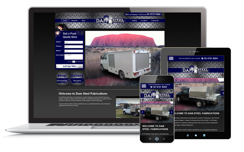
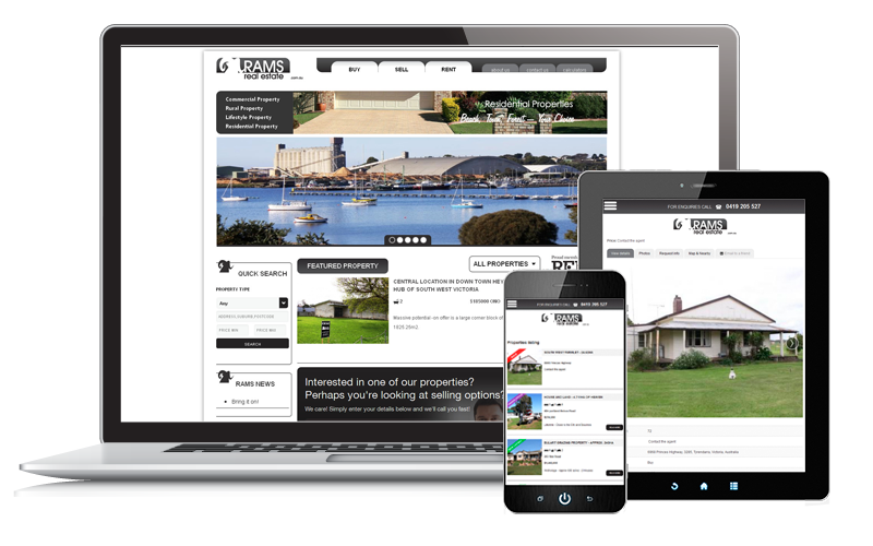
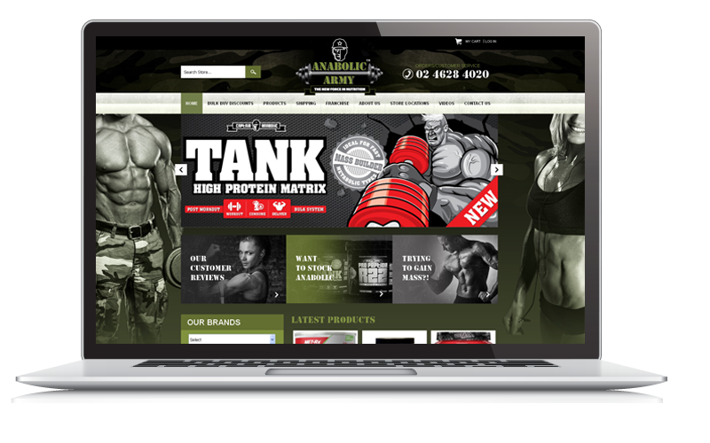
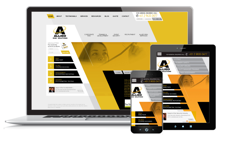
Mobile Optimisation Tip 1: Consider Multiple Image Sizes Whether you design with the mobile-first or mobile-second approach, you always have to consider the variety of image sizes required for the best user experience. Browser dimension and device orientation affect how images appear on the screen.
To optimise your website, use percentages and ems, instead of pixels. This lets the design adjust according to the zoom level, screen size and device orientation.
Mobile Optimisation Tip 2: Optimise Images Consider your website’s loading time too. Images are some of web design’s biggest bandwidth eaters. They become bigger issues in mobile devices. So, optimise your images to consider loading speed. Remember that connection speed can affect user experience. People want fast loading website; otherwise, they might move on to the next site.
Mobile Optimisation Tip 3: Try Using SVG SVG stands for Scalable Vector Graphics. It makes use of XML markup language as graphics, instead of images. These graphics are scalable and easy to animate through CSS. Popular image tools, such as Adobe Illustrator, support SVG so you can try it out whenever you want.
Mobile Optimisation Tip 4: Choose the Right Font Of course, your website is more than just graphics. A big chunk of it is made up of text. Make sure you choose a font that works on mobile devices. Stay away from fonts that are too thin or have little space in between letters. Likewise, choose one that’s scalable across different monitor size and zoom levels.
Mobile Optimisation Tip 5: Make Your Text Part of The User Interface Your website’s user interface makes up a huge part of the user experience. When you treat your text as part of the interface, optimising it for easy loading and readability follows automatically. Maintain a character per line limit of between 45 to 75 characters. Use media queries and consider using the vh, vhmin and vw values in CSS to get the best-fit font size for the device used.
Mobile Optimisation Tips 6: Make The Most of Color Contrasts Contrasting colors can add to your website’s readability across different devices. So, go beyond the “black over white” look. See what works and what adds to a better user experience for your readers.
Mobile Optimisation Tip 7: When Possible, Choose CSS3 Over Images CSS3 can be visually engaging as images. The advantage is that correctly coded CSS3 loads faster than images. They are the better option where it’s possible to substitute them for images.


