A professionally designed website has tell-tale signs. Put together, they make your website work for you, as it should.
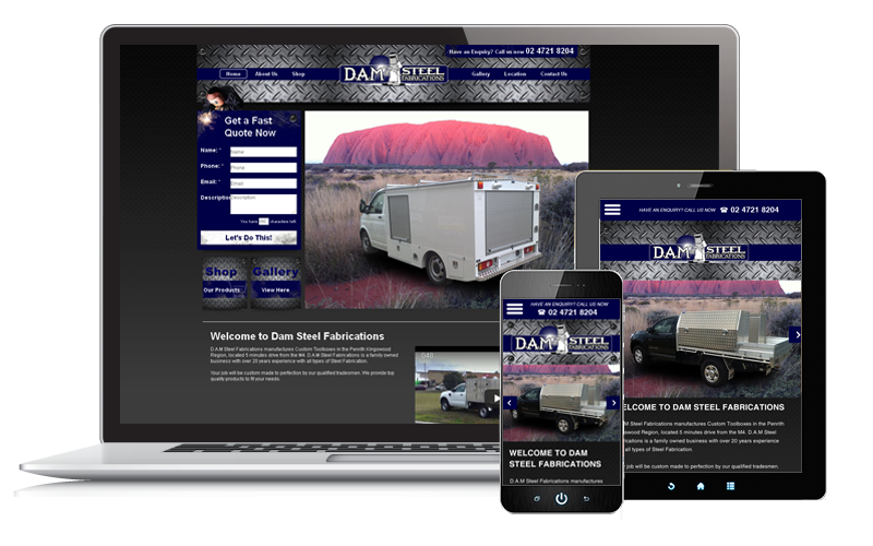
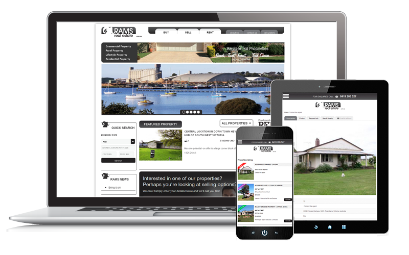
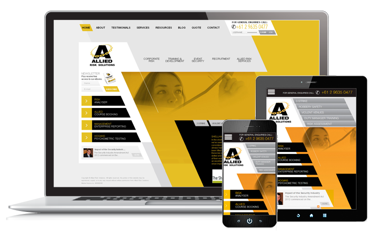
1. It is clean: In web design, 'clean' means simple. You immediately know what the site is about. The elements in each screenshot work together to get this message across. There is logic in how these elements are arranged.
When you begin developing a website for your business, it is easy to forget why you want online presence in the first place. There may be so many things that you want to tell customers – all of them important, all of them warranting a prime spot on your homepage.
A professional designer will tell you to keep your main goal in mind. Are you going online to sell? Then, your top products should be the visual focus of your homepage. There should be a Call to Action, and a Buy link. Everything else should be relegated as secondary or supporting content.
2. It is visually attractive: Simple doesn't mean lazy. Sure, you want to sell so why not just have a website with a photo of your product and a buy link below it, right? Your 8 year old can probably do that for you. And, you might actually sell a unit or two. But does it work? No.
A professionally designed website will not only generate leads or sell products, it will also make a mark with your target audience. You want your site visitors to remember your website. You want them to think of you whenever they need your product.
You can only make this happen if your website has visual appeal. Your audience must like your site enough such that they won't mind coming back to it every now and then. A sloppily made site, with eyesores here and there within its landing page, will not work.
It's an age old saying that's not true about love but true for websites: looks matter.
3. It is uncluttered: Uncluttered is different from clean. Let's use a desk as example. A desk can be clean. It is free from dust and debris. You even used an anti-bacterial liquid on it. A clean desk can be cluttered if it contains stacks upon stacks of books and documents, pens, pencils and picture frames; there's hardly any space for your laptop. It is hard on the eyes, and you don't know where to begin to look. An uncluttered desk has an optimally used area with enough free space. You know where to focus on.
You don't get tired just by looking at it. This is the same for websites.
Your customers know this innately. They've been on the web long enough and have gone through millions of sites. They may not be able to explain their behavior but certain websites work on them; others don't. And only professional web designers can bring all this together for you.


